Gone as a footnote in history:
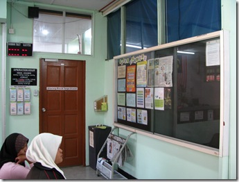
For the past couple of years, this was the facade that greeted every patient who required some meds from the Mukah Pharmacy.
Towards the left hand side of the first photo was the door into the pharmacy, and next to it, the notice board which I was helping the hospital admin to decorate. Actually I hijacked it without permission for pharmacy’s gain =).
This was the interior of the pharmacy dispensing counter. Normal.
I had nothing against light colours, besides the fact that it is so without character. It just blended into the background as part of the ‘hospital furniture’. Lifeless. Mundane. Lack of vibrancy. So not cheerful. Not distinct. No way to go for a ‘top class’ pharmacy. No standard.
That’s why it had to be transformed. After waiting for a whole month, at last I had the novelty to watch paint dry for the whole day and continue to gaze and wonder at the brand new pharmacy for another. Tadaa! Presenting the final result:
The new look of the pharmacy counter. Bright youthful orange encrusted by a outer wall of contrasting dark brick-red.
The door into the pharmacy beckoned, surrounded by a welcoming brick-red warmth.
The cheerful interior of the new-look dispensing counter.
The view from afar which I took just before we close for the day. Now we look different and will be different. Hope the positive ‘qi’ can increase staff morale and work rate. I am already happier. ^^


No comments:
Post a Comment